KROGER NUTS
BRANDING
|
DESIGN
|
PACKAGING
|
REDESIGN
|
BRANDING | DESIGN | PACKAGING | REDESIGN |
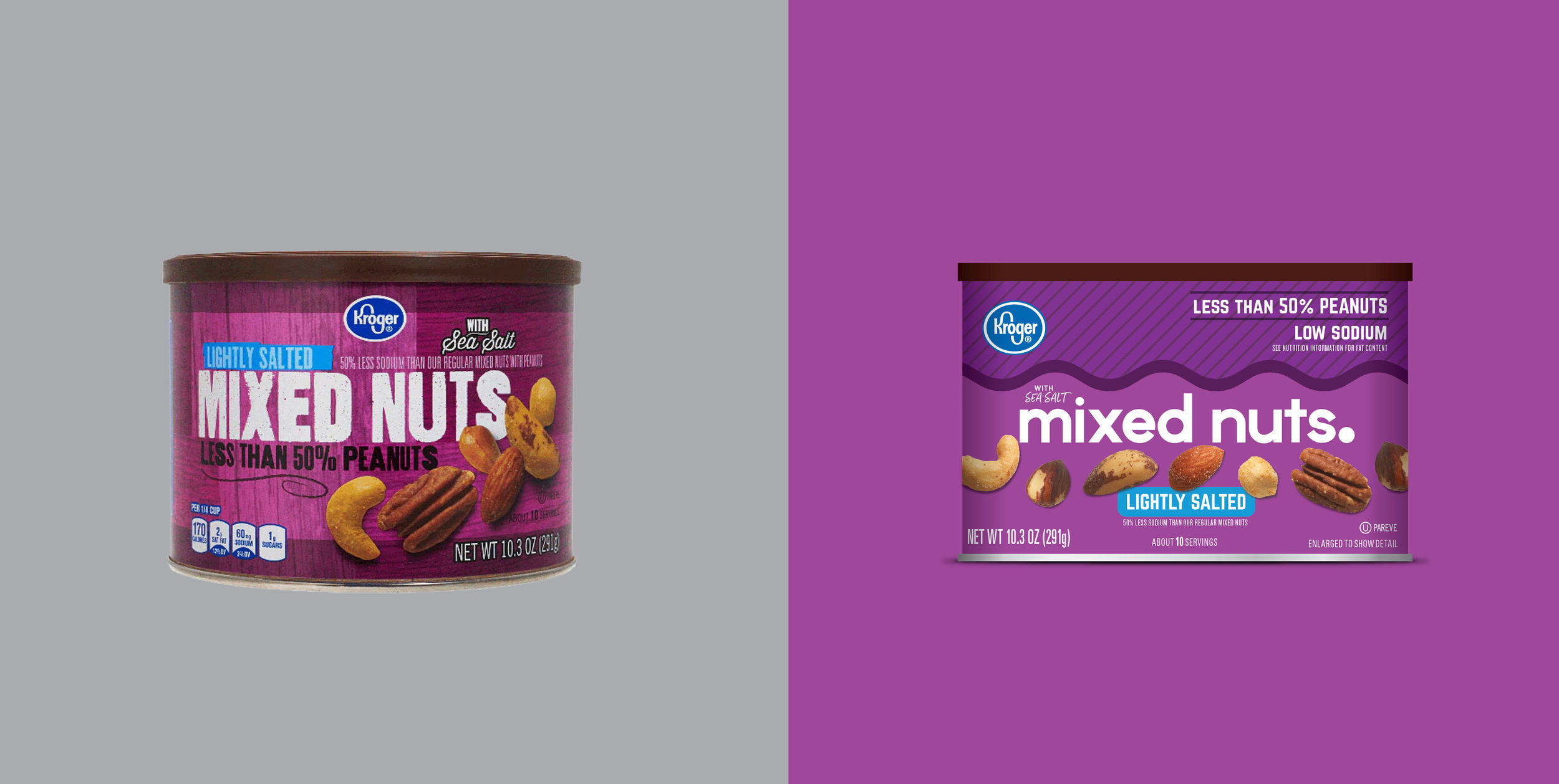
How do you make something as simple as nuts look new, exciting and different? All it took was adding some flavor. Kroger's in-house nut line was looking for a refresh - something to ensure it could stand out on shelf and appeal more than the competitors. As consumers introduce nuts as a part of their healthy lifestyles, creating packaging that felt like a part of that was key - bold clean lines, dynamic movement and bright colors make these cans pop in the best way and convey the appealing flavors inside before you even taste them.